Resolving Sign-In & Authentication Issues at Compound Planning
Case Study
My role: Lead Product Designer
Focus Areas: End-to-end product design across client and internal surfaces. Ownership of user journey mapping, embedded experiences, cross-functional collaboration, and service design improvements.
Timeline: 4 weeks

Background
Compound Planning is a financial advisory firm that provides clients with a personalized net worth tracker. This dashboard gives clients a comprehensive, real-time view of their assets, liabilities, and overall financial picture, and is central to how they collaborate with their advisor.
Clients can access their dashboard by either requesting an account through Compound’s website or by using a unique referral link from their advisor, which ensures their data is correctly tied to the advisor’s system.

Problem 1
Duplicate Dashbaords
Users who mistyped or changed their email during sign-up accidentally created multiple dashboards. This fragmented their data and made it difficult for both clients and advisors to maintain a consistent financial view.
Solution Direction
Prevent duplicate dashboards by recognizing existing accounts early and ensuring users were properly routed through advisor referral links or known paths.
Problem 2
Authentication Mismatch
Originally, sign-up was only available through Google or Apple ID (SSO). When email/password login (Auth0) was later introduced, users unaware of their original method often tried to re-register, resulting in account duplication or login errors. In addition, Advisors lacked tools to identify how clients signed up, making it hard to troubleshoot.
Solution Direction
Detect authentication methods to automatically guide users to the correct login flow (e.g., SSO vs. email/password).
Problem 3
Referral Link Misses
Clients who skipped the advisor’s referral link and signed up directly were not correctly linked to their advisor’s system. This created invisible dashboards to their advisors —the core value of Compound’s offering. This blocked collaboration and created immediate distrust in the product.
Solution Direction
Ensure clients were properly using sign-up referral links from their advisors.


Problem 4
UI Confusion
Login and sign-up screens lacked clear distinctions. Many users attempted the wrong action, leading to unnecessary errors or new dashboard creation.
Solution Direction
Clarify login vs. sign-up interfaces to reduce user confusion at the very first touchpoint.
Research Approach
After noticing a high volume of support requests related to login and sign-up confusion, I took the initiative to investigate the root causes. My first step was to map out the end-to-end user journey—from receiving a referral link to attempting to access a dashboard—capturing each decision point and interface touch.
By translating these findings into a visual story, I was able to clearly demonstrate where users were getting stuck and why the experience felt broken. Presenting this to stakeholders helped align the team on the urgency of the issue and led to dedicated time and resources for a full redesign.
Through this visual breakdown, I identified key areas of friction: unclear CTAs, ambiguous screen language, and inconsistent paths depending on the login method.
User Flow Mapping: I detailed user journeys to help other stakeholders visualize the client experience and pinpoint the areas of friction.

Best Practices Research
To inform the redesign, I conducted a competitive audit of modern sign-up and login flows, reviewing UX case studies and Medium articles that highlighted best-in-class experiences from products like Canva, Stripe, Gmail, and Spotify.
Findings
This research helped identify patterns around clear entry points, progressive disclosure, and account recovery that reduce user friction and improve authentication success rates.

Design Solutions
I began with low- and mid-fidelity wireframes, focusing first on two key screens:
Sign Up / Create Account
Login
I then designed for edge cases to create a smoother experience:
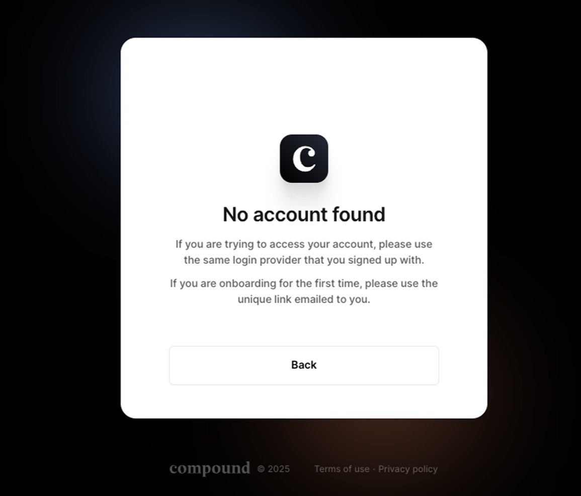
If no account was found during login, users would be redirected to the sign-up screen.
If a user entered an existing email on the sign-up screen, they’d be routed to the login screen instead.
These flows aimed to reduce friction and prevent duplicate accounts.

Before: Create Account, and Login Screens
After PM feedback, I developed high-fidelity wireframes with clearer guidance for users. On the Create Account screen, a subheader explains that users must continue using their chosen sign-up method for future logins, aiming to reduce confusion. I also added subtext to the SSO buttons to highlight their security benefits.
I redesigned the Login screen to include smart email detection—users enter their email, and the system identifies their original sign-up method, directing them to the correct login path (e.g., Gmail for Google SSO, password field for Auth0).
Adding the SSO options below the email field was a compromise with the PM, who originally proposed a smart input-only flow. I raised concerns around masked Apple emails (e.g., private.relay.com) and forgotten secondary emails, which could lead to login errors. Prioritizing SSO buttons supports user recall by leveraging familiarity and muscle memory.

After: Create Account and Login Screens
High-fidelity wireframes
Collaborating with the lead designer, we finalized high-fidelity wireframes for all user-facing screens, including edge cases. The redesign emphasized clearer language and improved visual hierarchy to guide users more intuitively.

Usability Testing & Iteration
Regular usability tests were conducted with the engineering team to validate flows and build logic that checks for existing accounts and login methods.
Launch & Iteration: The new onboarding flow was launched with better guardrails and logic to recognize existing accounts and encourage correct entry through referral links.
Second Iteration: Advisor-Focused Enhancements
After addressing the client-side we turned our focus on improving the advisor experience in version 2 of the authentication system.
Advisors often struggled to troubleshoot client onboarding issues due to a lack of visibility into sign-up methods and dashboard status. To solve this, we introduced a new tab within the client’s record in AdvisorHQ, designed to give advisors real-time insights into client onboarding progress and potential blockers.
Live Status Updates:
Advisors can take actions (e.g., generate dashboard, resend email verification), and the interface instantly reflects changes without needing a page refresh — enabling smoother client follow-up.
This second iteration significantly improved the advisor support experience, turning a once opaque onboarding process into a transparent, actionable, and real-time system. These improvements not only empowered advisors to provide better support but also reduced internal support escalations, especially during busy onboarding periods.
Key Features in v2 for Advisors:
Centralized view of each household’s dashboard creation and acceptance status
Clickable dashboard URL if dashboard exists.
Shows "Preview dashboard" if the dashboard is generated but not yet accepted.
Displays "No dashboard generated yet" if none exists.
Action buttons like “Re-send verification email” and “Generate dashboard.”
Email verification status for both primary and authorized users.

Reflection & Results
Redesigning the authentication flow was a deeply iterative process, grounded in real user frustration and internal support patterns. By stepping into the shoes of both clients and advisors, I was able to surface pain points that were previously overlooked and champion a more seamless, thoughtful experience from the first interaction.
Key Outcomes:
Reduced Support Requests: After launch, internal support tickets related to login and sign-up dropped significantly—an early indicator that the redesign addressed core usability issues.
Improved Advisor Visibility: With the addition of new dashboard tracking tools in AdvisorHQ, advisors could more easily troubleshoot and guide their clients through the onboarding process.
Fewer Duplicate Dashboards: The new preventative checks and clearer sign-up guidance led to a notable decrease in duplicate dashboards, improving data consistency and reducing confusion across teams.
Stronger First Impressions: Clearer language, refined visual hierarchy, and smarter authentication routing helped reinforce trust from clients at their very first touchpoint with the product.