Overview
Compound previously outsourced tax filing to external partners, forcing clients and advisors to navigate multiple disconnected systems. With tax season approaching, the team had 7 weeks to launch an MVP integrating tax filing directly into the Compound dashboard.
The Challenge
A fragmented tax experience created confusion and operational drag
Before the redesign, clients lacked visibility into their filing status.
Advisors tracked filings manually across spreadsheets, Salesforce, and email threads.
This led to:
high support volume during tax season
repeated client follow-ups
hours of manual coordination by advisors
loss of structured tax data within Compound's ecosystem
Research
Understanding Advisor workflows and client anxiety
Research included:
Support ticket analysis from the previous tax season
Interviews with financial advisors
Conversations with the Head of Tax
Key Insights
Lack of visibility caused repeated client check-ins
Clients had no way to track the status of their tax returns.
Advisors relied on manual tracking systems
Tracking filings across multiple partners created operational risk.
Tax complexity required multiple service pathways
Not every client could file through the same provider.
Design Strategy
Balance discovery with eligibility
With a new tax partner, and two different user segments, the design team had multiple surface areas to cover:
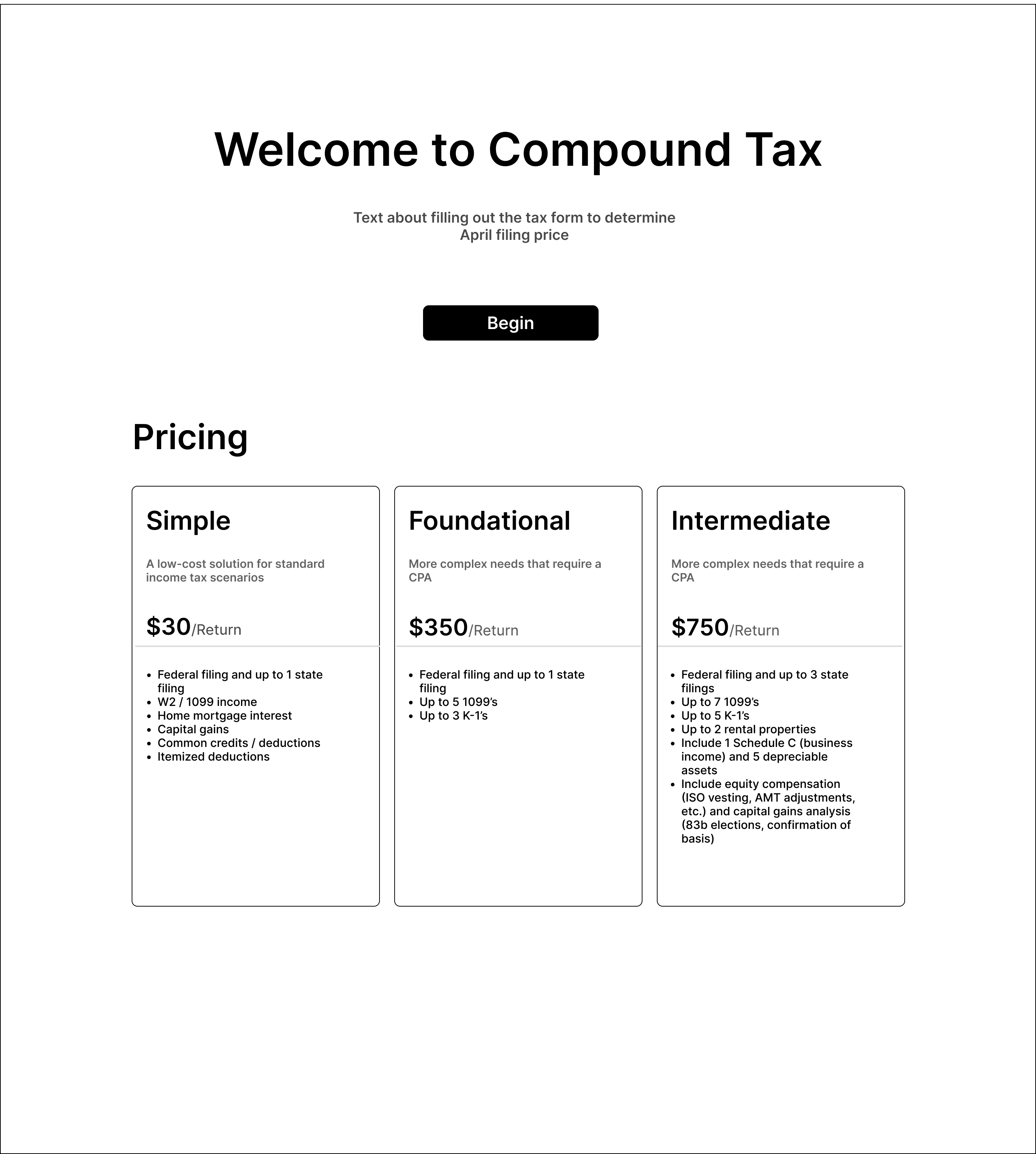
We explored three wireframe approaches to present tax filing options to clients:

Mockup 1
Start Filing Immediately
Allows users to begin filing in-app with pricing tiers based on complexity, but risks users progressing through a flow only to learn their filing can't be completed in-app.

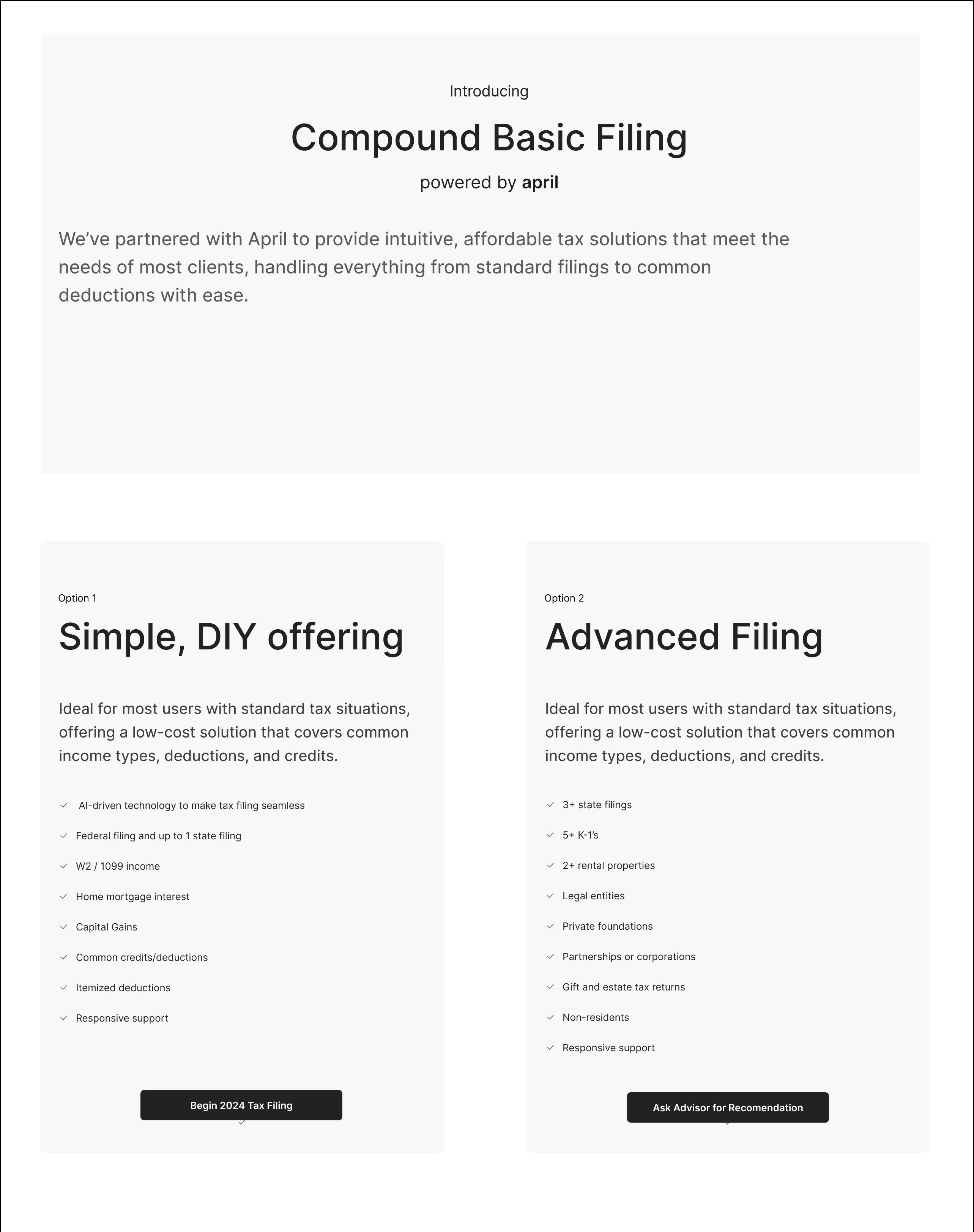
Mockup 2
Prioritize April integration
Emphasizes our partnership with April and enables immediate filing for two supported tiers, but excludes users with complex returns, limiting service discoverability.

Mockup 3
Show all options upfront
Surfaces all tax partners and pathways upfront, but introduced unnecessary cognitive load and unclear prioritization.
Design Execution
Key UX Improvements
After reviewing competitor booking flows, I identified patterns that reduced friction and used these insights to restructure the site around user intent.

Guide Client Discovery
The three tiers helped clients self-identify their tax needs based on complexity and helped reduce cognitive load, and increase confidence through clear upfront pricing. For April’s API-powered tiers (Tier 1 and 2), filing occurred directly inside the Compound dashboard which decreased advisor intervention for straightforward returns.

Track and Centralize Client Filings
For complex returns (Tier 3), clients triggered an advisor notification, and advisors selected the appropriate external partner within the system. This preserved flexibility for high-complexity returns, while also centralizing partner assignments within Compound, replacing manual tracking. Advisors also gained a unified client book view showing filing partner, filing status, refund/payment information and key tax metadata.
Outcomes
A fragmented process became a centralized product experience
The MVP shipped within 7 weeks, and transformed tax filing from a disconnected outsourced service into a structured product within the Compound ecosystem.
Overall, the redesign created:
greater client trust
reduced operational overhead
scalable infrastructure for future partners
15
Minutes saved per client tax assignment

