Overview
Many productivity tools assume users can easily initiate tasks and maintain focus. For people with ADHD and executive functioning challenges, this assumption often breaks down. As someone who experiences executive dysfunction firsthand, I noticed that even helpful tools like Pomodoro timers were easy to avoid. If the workload felt ambiguous or overwhelming, I simply didn’t start.
The Challenge
Traditional Productivity tools prioritize structure over emotional support
Existing tools optimized for time management, but not for emotional regulation or task initiation. Research revealed three common barriers:
Task initiation paralysis
Users struggled most at the start of the day when priorities were unclear.
Overwhelm from rigid productivity systems
Highly structured tools often increased anxiety instead of reducing it.
Emotional friction around productivity
Users reported guilt and shame when they felt “unproductive.”
Goal
Design a mobile focus tool that helps neurodivergent users initiate work gently and sustain focus without shame or pressure.
Research
Understanding how Neurodivergent users approach focus
To understand booking behavior, I conducted 6 user interviews with individuals who had previously worked with personal trainers.The goal was to uncover:
What motivates them to begin tasks?
Key Insights
Users react to tasks instead of planning them
Most participants started their day responding to Slack messages or emails rather than intentional planning.
To-do lists were common—but rarely completed
Lists often became overwhelming and were abandoned.
Emotional friction blocked task initiation
Participants frequently reported feelings of guilt and frustration when struggling to start work.
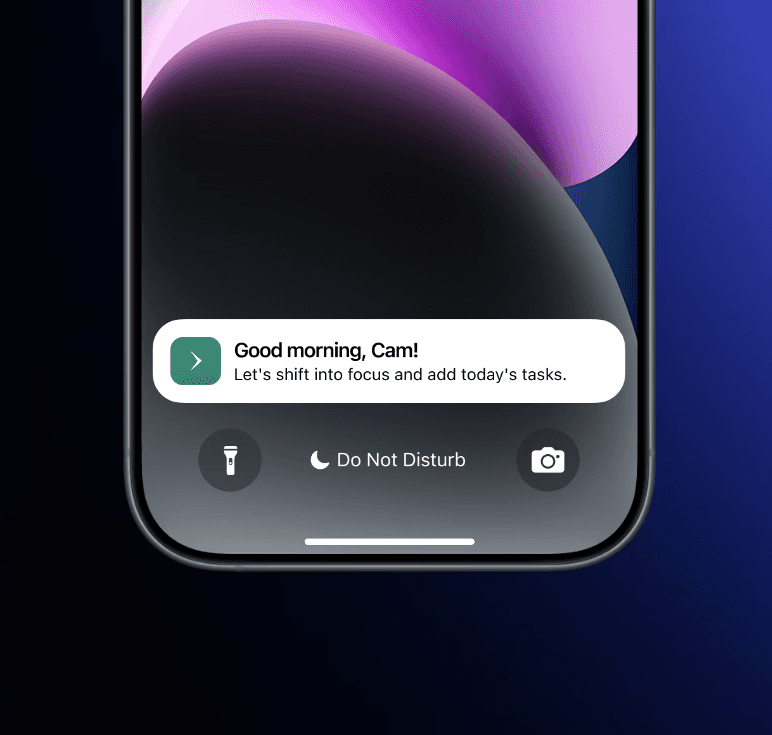
Supportive tone matters
Users preferred tools that felt encouraging rather than judgmental.
Design Strategy
How might we help users start their day with clarity and calm?
The design focused on these three principles:
Reduce cognitive load -> Simplify task creation and focus sessions
Encourage gentle task initiation -> guide users to work gradually rather than demand immediate productivity
Support emotional regulation -> integrate calming elements
Design Execution
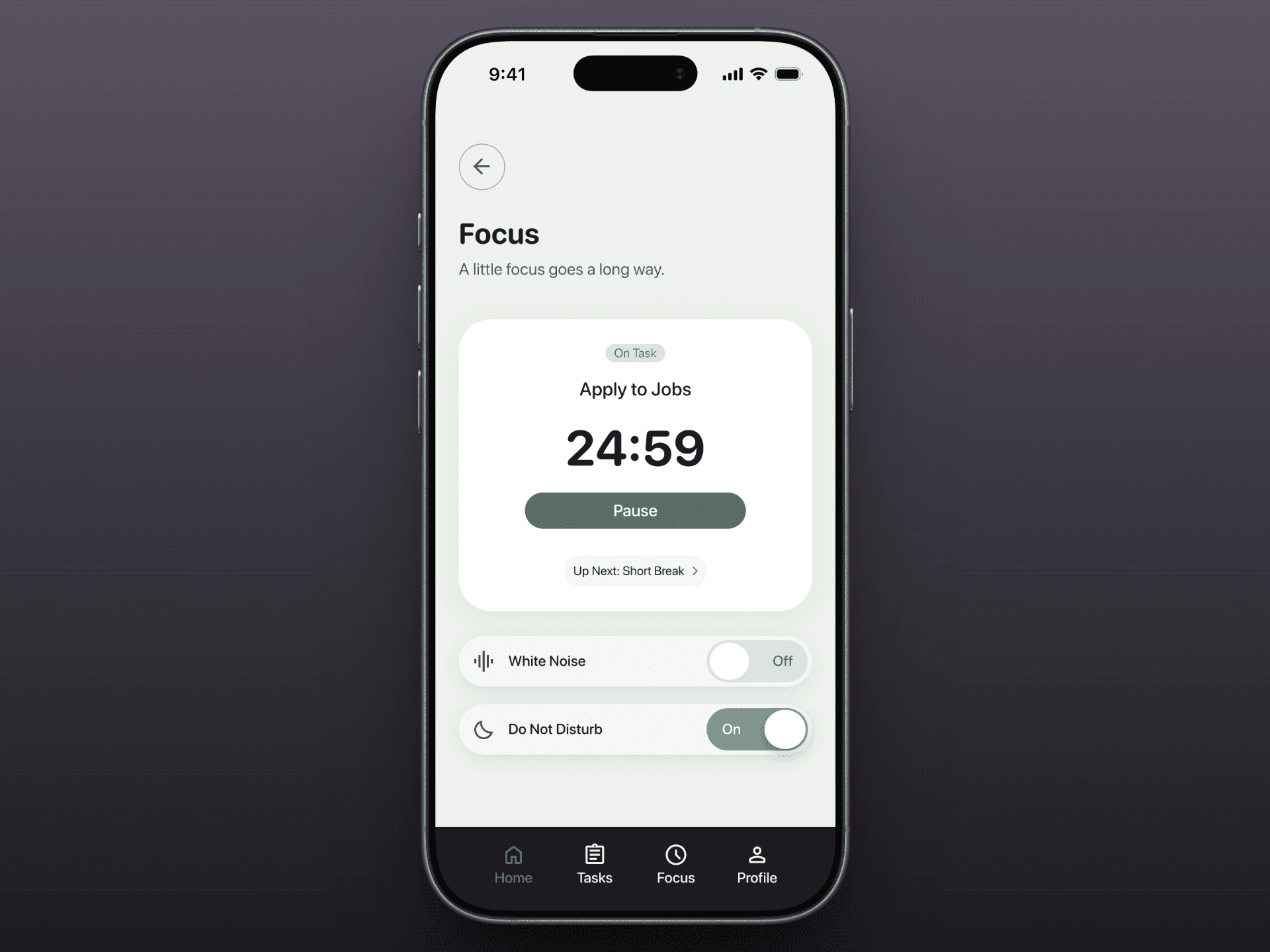
Designing a guided morning focus ritual
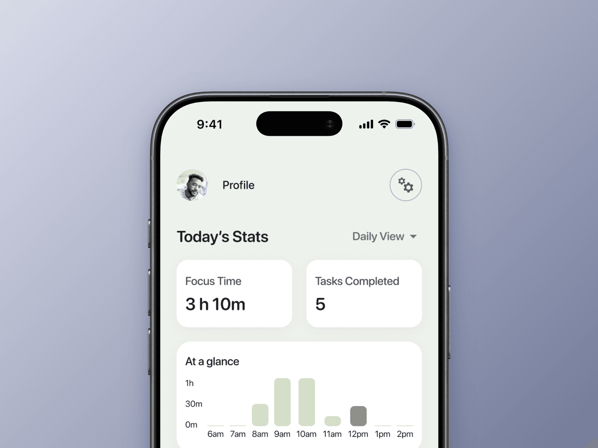
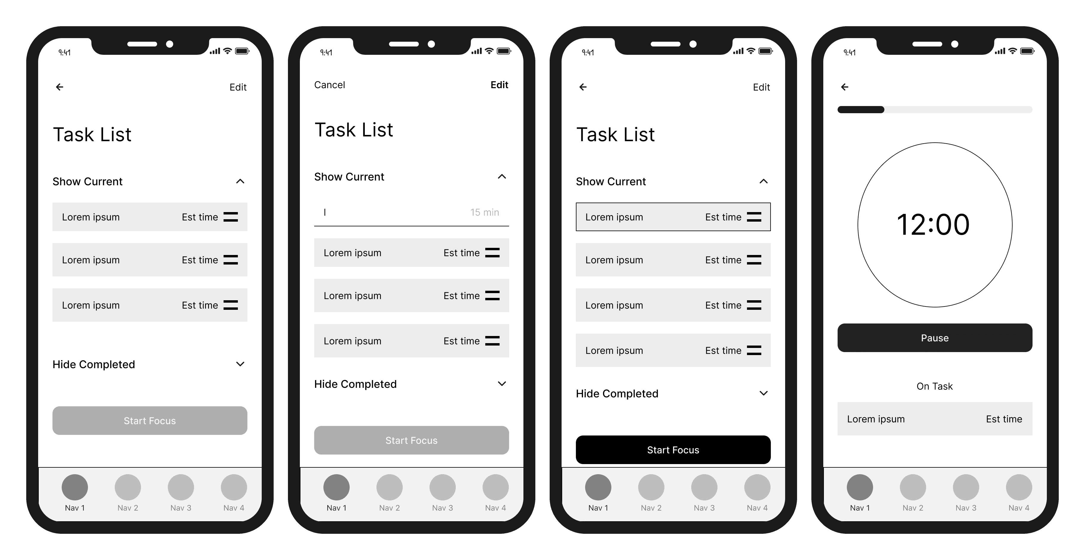
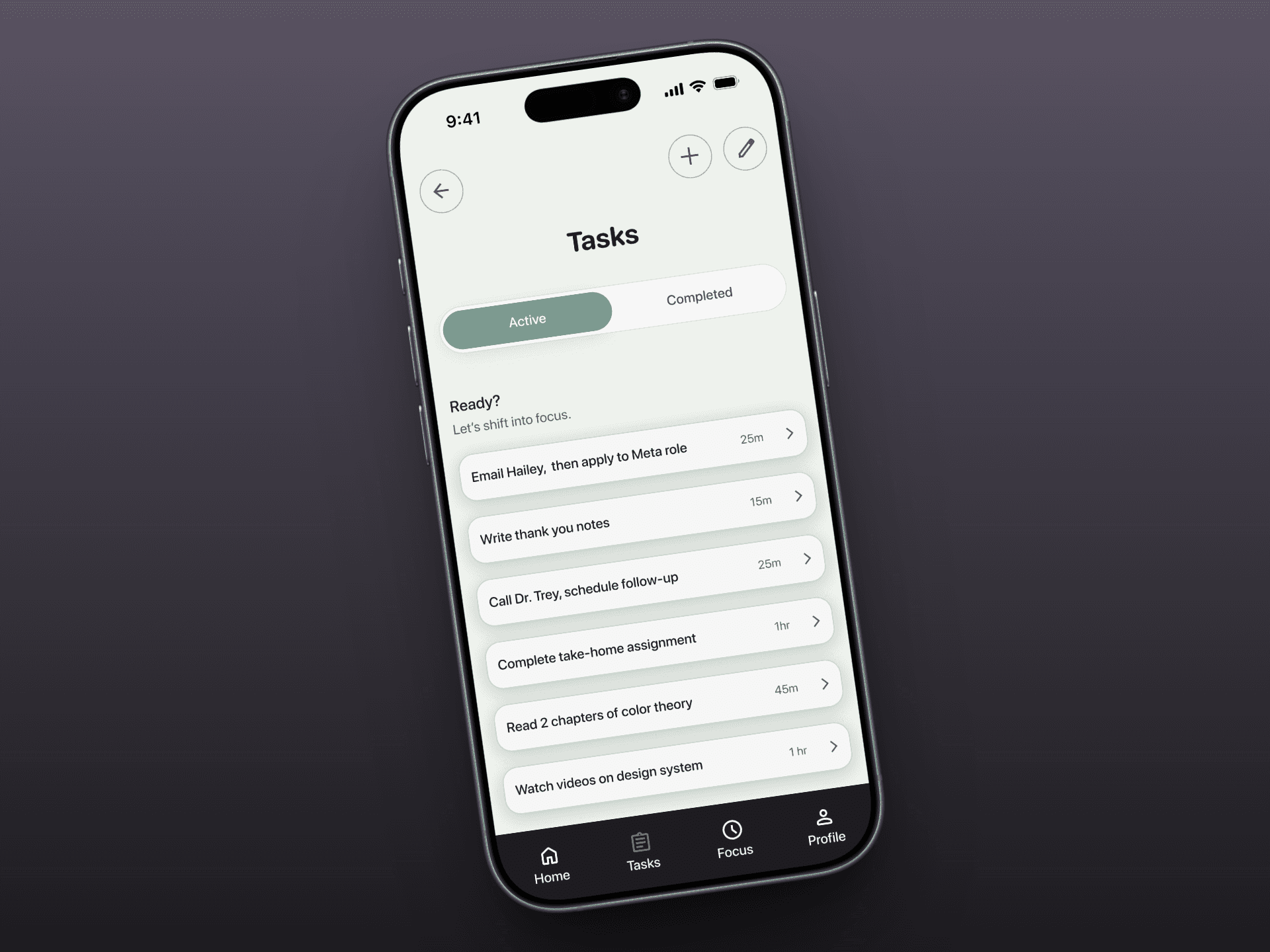
The product centers around 3 core features, including a Task List - to help users plan out their day and identify priorities quickly, and a Pomodoro Focus Session. These sketches illustrate the interaction flows and tested the layout and hierarchy of information.
Usability Testing
Evaluating cognitive load and clarity
I conducted usability testing with 6 participants.
Participants completed tasks including:
creating tasks
starting a focus session
navigating key screens
The experience proved intuitive and emotionally supportive. Participants completed core tasks quickly with minimal hesitation and consistently described the interface as:
“Calming”
“Simple”
“Encouraging”
Minor usability improvements included improving tap affordances on some interactive elements.
Reflections
Key Learnings & next steps
Designing productivity tools for neurodivergent users requires addressing both structure and emotion.
Small details, like tone of voice, visual calmness, and gentle prompts, can make the difference between avoiding a task and starting one.
Future iterations could explore:
expanded focus modes for different work styles
adaptive task prioritization
additional research into wellness interventions that best support executive function